( BRAND STRATEGY ) ( TONE OF VOICE ) ( PACKAGING DESIGN )
That Hippie Co
That Hippie Co's new range of wellness gummies for men were entering the crowded US market. Struggling with an array of challenges, from stress to hair loss, weight, sleep and impotence, research insights showed this target audience often feel ignored in a saturated market that can lack tact and be condescending. With sympathy and understanding, That Hippie Co aspired to create a brand that would truly resonate.

(THE SOLUTION)
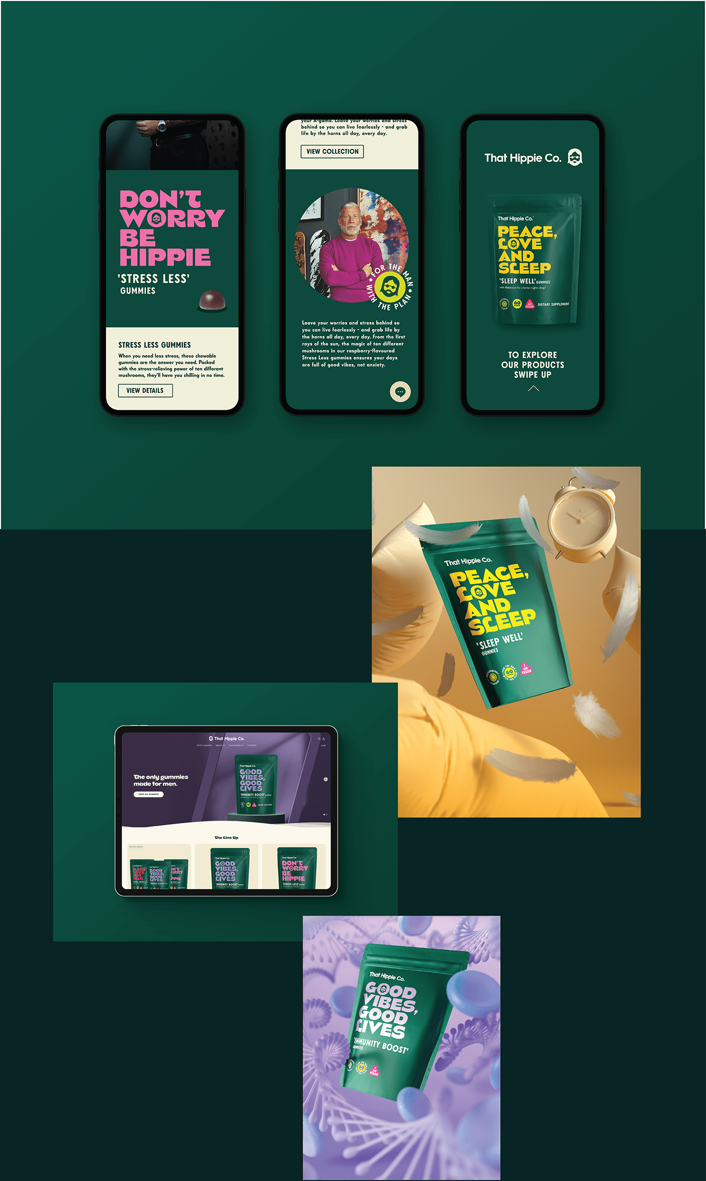
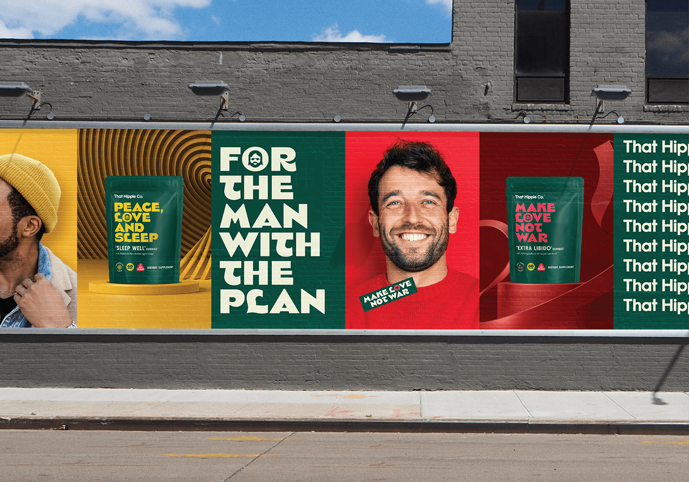
Our goal was to bring clarity, comfort, and levity to the brand. Embracing the brands founding hippie spirit, we crafted a friendly, playful, and straightforward tone of voice that engages rather than alienates. With humour-filled copy and bold typography, we broke away from the mundane and awkward language often associated with similar products. The packaging also reflects this sense
of comfort, with its relaxed yet clear design giving a premium and trustworthy vibe, complementing any home setting. The variant names are upbeat and benefit-focused, offering an uplifting and targeted experience.